TAMPA BAY BUCCANEERS
HIGH CONTRAST
HIGH ENERGY
EDGY
Create exciting and dynamic animations to enhance the live game experience of a Tampa Bay Buccaneers Football Game.
concepts
design
animation
CONCEPTS
01
02
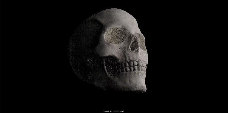
IRONCLAD SKULL
All sports should look just as cool
this design style is one that has proven to be successful in my favorite competitive sport, E-sports. Not only does it look great, it creates plenty of opportunities for dynamic, eye capturing movement. Through type and 3D visuals, the audience will be taken through an exciting + experience.

HALF THE HYPE
Bring the explosive energy of comics into a sleek vector illustration
I have always had a love for the texture and energy given to pieces simply from the use of halftones, especially in comics. With energetic type animation + exciting 2D VFX the hype of the crowd would only be half of the energy.


VISUAL IDENTITY
FONTS
Heavy, 600 px
Termina is a bold, geometric sans-serif typeface designed for impactful, modern designs. It features clean, sharp lines and a balanced, minimalist structure, making it perfect for strong, attention-grabbing headings. Its letterforms are solid and straightforward, with consistent proportions and a slightly condensed appearance, which adds to its contemporary feel. The font's simplicity lends itself well to both print and digital media, and its geometric construction ensures legibility even at larger sizes. Termina exudes a sense of strength and clarity, often used in branding, posters, and advertising where a bold, modern statement is required.
TERMINA
Color Palette
Power. Strength. Aggressive.
The Tampa Bay Buccaneers color palette features red, pewter, orange, and white. With the red to demonstrate aggression and blood of the team, as well as a hierarchal orange color, this color palette successful creates an energized presence for the audience.
Termina is a font that exudes strength, all while remaining legible and bold in a variety of sizes and animations. Thus, it was a perfect fit in order to communicate with the audience.
TECHNICAL PROCESS
CINEMA 4D
Lighting
For the lighting, I used a combination of three primary light sources to parented to three separate cameras to have control over my angles, and my lighting at one. The key light was position in front of the objects with the other two about 60 and 30 degrees to the left and right of it; casting strong, defined shadows to emphasize the skulls shape and features. An HDRI was set up as a studio environment to make the objects’ lighting more realistic.
Texturing
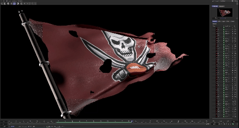
For the texturing, I used a combination of bump maps of worn bone to ensure that the skull had the many features of a real life skull. The texturing of the flag was actually a book pattern, expanded across a plane to create a nice knitted effect. As well as the football utilizing a bump map that simulated the real things’ texture to secure realism.
STUDIO LIGHTING
Shadow-side lighting is a cinematic and photographic technique where the primary light source is placed to illuminate one side of the subject while leaving the other side in shadow. This creates a strong contrast between light and dark areas, emphasizing depth and form.


REDSHIFT
I textured the skull in RedShift by integrating a noise node to create natural, organic patterns. By carefully adjusting parameters such as scale, contrast, and frequency, I achieved a detailed, weathered look that adds depth and realism to the surface. The noise was applied to the material's nbump channels, giving the objects an authentic, semi-realistic appearance while maintaining flexibility for future adjustments.
Animation
I animated the skull in Cinema 4D by using the scale parameter to make it appear as though it was popping up from thin air. To refine the motion, I used Cinema 4D’s F-curve editor to adjust the eases, creating smoother transitions and more natural acceleration and deceleration. This allowed me to control the timing and impact of the animation, giving it a polished, dynamic feel.

Animation principles
I used a specific pool of animation principles that I knew would assimilate with the Buccaneer briefs wants and needs. For the kinetic type portion of this project, I mainly focused on utilizing slow in slow out with Ae’s graph editor. As for the 3D portion of this project, I was able to use Cinema 4D’s notorious f-curve tool to finely tune the curves of my animations. Other principles used include overlap and followthrough, and overshoot. Anticipation was much more implied for this project so that everything was in your face graphics.

After Effects
Kinetic Type
For the 2D kinetic typography, I used Adobe After Effects to create smooth and dynamic motion. I began by organizing my type layers and setting up the composition at 24 frames per second to ensure fluid animation. Using keyframes, I animated the movement of the elements, adjusting position, scale, and rotation to bring them to life. I applied easing to keyframes (using the graph editor) to create natural motion and give the animation a more polished, professional look.
To enhance the visuals, I used a variety (and many) masks, and track mattes to create transitions and effects. I also added the echo effect to certain elements in order to exaggerate the speed of my elements, ensuring the animation had depth and energy. Effects like echo, displacement map, cc scale wipe, and more were applied to enhance specific parts of the animation.
Lastly, I rendered the composition using H.264 with 2 VBR passes to ensure optimal quality for final output.
Vector Animation
For all 2D vector animation, I used Adobe After Effects to meet the expressive capabilities of this project. Assets were made and manipulated in After Effects and compiled together in various pre comps.Using the speed graph, I animated the movement of the vector elements particularly in large, efficient groups that would require 1-3 null objects by adjusting position, scale.
This particular part of the project was designed in order to maintain the energy after it was lost at the final moments of the animations. All of it was made in one pre comp that could be organized over top other pre comps and animate and outdo where needed within the project. Effects like cc scale wipe and block dissolve were added to exaggerate the motion.


2D + 3D Integration
RENDERING
PNG Sequences
I rendered PNG sequences in Cinema 4D using Redshift to ensure high-quality outputs with flexibility in post-production. By rendering as PNGs, I maintained transparency where needed and ensured lossless image quality. I configured Redshift's render settings to handle lighting, shadows, and reflections efficiently, resulting in clean, crisp sequences that were easy to work with in compositing and editing stages.
Integrating in AE
Shadow-side lighting is a cinematic and photographic technique where the primary light source is placed to illuminate one side of the subject while leaving the other side in shadow. This creates a strong contrast between light and dark areas, emphasizing depth and form.

Layering
I was able to import Redshifts PNG sequences into After Effects, and then integrate them over top of 2D animation with strategic layering. The use of PNGS expedited this process as I was able to render out an alpha channel for all objects to ensure a clean mask.


This is a screen captures that demonstrates how my layer was done in order to combine many elements all with their own motion going on
