BRISBANE OLYMPICS
RICH
HIGHLY DETAILED
IMMERSIVE
Create a 5-10 second logo animation for the Brisbane Olympics games set for 2032.
concepts
design
animation
CONCEPTS
01
02
Oasis
a sanctuary where past and future can meet
Inspired by the birthplace of the games, this project marries the serene allure of a classical agora with cutting-edge design, creating a haven of triumph and tranquility.

golden Gate
a luxurious display of Brisbane architecture through grand textures.
The chosen direction, as well as a grand opening of the Olympic Games set to take place in Brisbane Australia. Within each carving of filigree is a story of athletic triumph.


a pheonix project
The difference
original
My original creation of the intro for the Brisbane Olympics was done In Adobe After Effects using vector shapes and a simple play on lights and scale. For animation, it was a more simple process in animating the vectors’ scale properties, animating the flow of gradients and After Effect’s CC Light Sweep. This animation, while yes it was effective in introducing the logo, it never felt like this project reached in zeniths in what the Olympics means for humanity. My hope was to revisit it in 3D in order to capture a more outstanding approach to the logo’s introduction as well as its significance while still maintaining the original logo’s inspiration from Brisbane’s architecture.
updated
I believe the updated version of this project is.a better representation of the Brisbane Olympic’s significance as a celebration of human excellence in form and in unity. The animation, as well as the textures and sound design of this project meet in a confined unity that makes this piece more tangible in a way for the audience. Gold and black representing a formal invitation for people to celebrate human excellence as they enter the gateways of triumph.


VISUAL IDENTITY
Textures
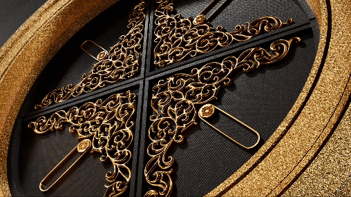
Designing the textures for my 3D scene of the Brisbane Olympics logo, I drew inspiration from the intricate filigree patterns adorning the city’s historic architectural style. These decorative elements, seen in the lace-like ironwork of verandas and facades, embody Brisbane's unique blend of elegance and craftsmanship. Translated into the 3D space, these textures capture the essence of lightness and detail, weaving subtle shadows and highlights into the design. The result is a visual narrative that pays homage to Brisbane’s architectural heritage while enhancing the modern spirit of the Olympic Games.


cOLOR PALETTE
Spirit. Elegance. Victory.
Gold, synonymous with excellence and victory, reflects the pinnacle of athletic achievement and Brisbane’s sunlit vibrancy. Black, with its depth and timelessness, anchors the design, lending it a bold and striking presence. This palette not only amplifies the elegance of the filigree-inspired textures but also underscores the grandeur of the Olympic spirit, celebrating Brisbane’s heritage and its vision for a luminous future.

Elegant textures enhance the concept by adding a layer of refinement and depth to the design, echoing the sophistication of Brisbane’s architectural filigree. The intricate details within the textures evoke a sense of craftsmanship and heritage, reinforcing the timeless quality of the black and gold palette.
TECHNICAL PROCESS
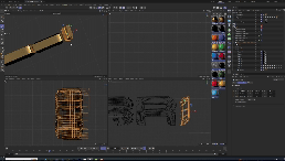
CINEMA 4D
Texturing
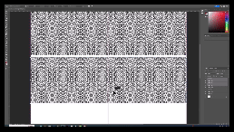
To create the intricate filigree textures for my 3D scene, I began in Photoshop, crafting seamless tiles that were inherent of Brisbane’s architectural patterns. Using precise vector shapes and layering techniques, With high resolution tiles, I was able to convert them into a grayscale to serve as a bump maps, carefully adjusting the contrast to ensure the depth and texture would translate well in 3D. This bump map was then applied to my 3D model, adding intricate surface detail that enhanced the interplay of light and shadow, bringing the quality and richness of the gold to life.
Redshift
I Imported the tiled images into Redshift as an image texture and ran them through a bump map node or height map in the material settings. This allowed Redshift to use the grayscale values—white for high points and black for low points—to simulate surface depth, adding realistic detail without extra geometry.
Animation

Messing with the displacement properties of Cinema 4D, I was able to orchestrate the individual elements of the logo to move with fluidity and purpose, symbolizing the dynamic spirit of the Games. Filigree-inspired textures shimmer as they interact with gradient lighting, creating a play of highlights that enhance the black and gold palette. Camera movements add a sense of scale and drama, focusing on intricate details before revealing the logo in its entirety.
Animation SFX
In an appointment with my sound designer, Kelly Warner, we agreed that the most suitable sound design for this project was an orchestral piece that played into the light and shadows carved into the gold of this animation. Once the timing was determined, Kelly and I were able to allot piano sequences-translated and layered into and with other ochestra instruments- and sound effects for different parts of the animation.
